Vmbasic is a modern Joomla! 5 ready template developed using Bootstrap 5. The template is lightweight and minimal to achieve fast loading times and easy customization.
Below are some of its main features:
- Joomla! 5 ready
- Bootstrap 5 html structure, css and js
- Child template creation
- Mobile friendly and optimized layouts
- Option for custom inline css
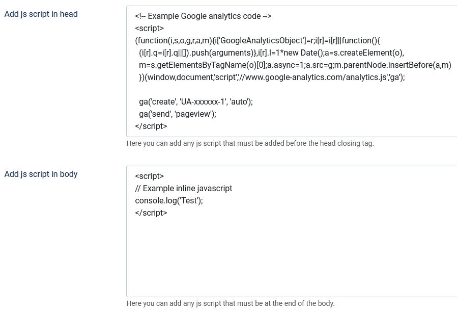
- Option to add js script in head or body (Google analytics etc)
- Option to load custom css file (user.css)
- Google fonts support
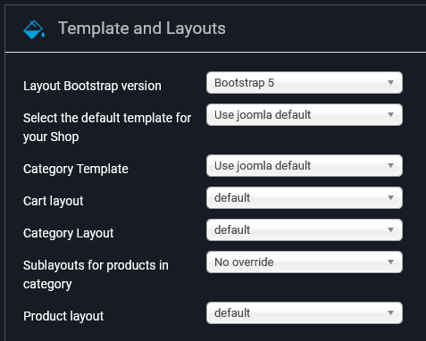
How to add your logo
To add your logo to the template follow these steps:
- Navigate to System -> Site Template Styles -> and click on the "vmbasic - Default" link.
- Select the "Template Configuration" tab
- In the "Upload your logo" field click the green "Select" button
- Now select or upload the desired image and click the green "Select" button on the top right section of the window .
- Click the "Save" or "Save & Close button".
If you want the logo to be displayed in your footer, click yes in the "Display logo in the footer" field.
To display the logo properly, please use a high quality image with the appropriate dimensions, we suggest a maximum height of 80px and a maximum width of 400px.
How to display a Back to Top button
To enable the Back to Top button, follow these steps:
- Navigate to System -> Site Template Styles -> and click on the "vmbasic - Default" link.
- Select the "Template Configuration" tab
- Click "Yes" in the "Back to top button" field
- Click the "Save" or "Save & Close" button.
Google fonts
To add and use Google Fonts, follow these steps:
- Go to the Google Fonts website to get the code for the font you want.
- Navigate to System -> Site Template Styles -> and click on the "vmbasic - Default" link.
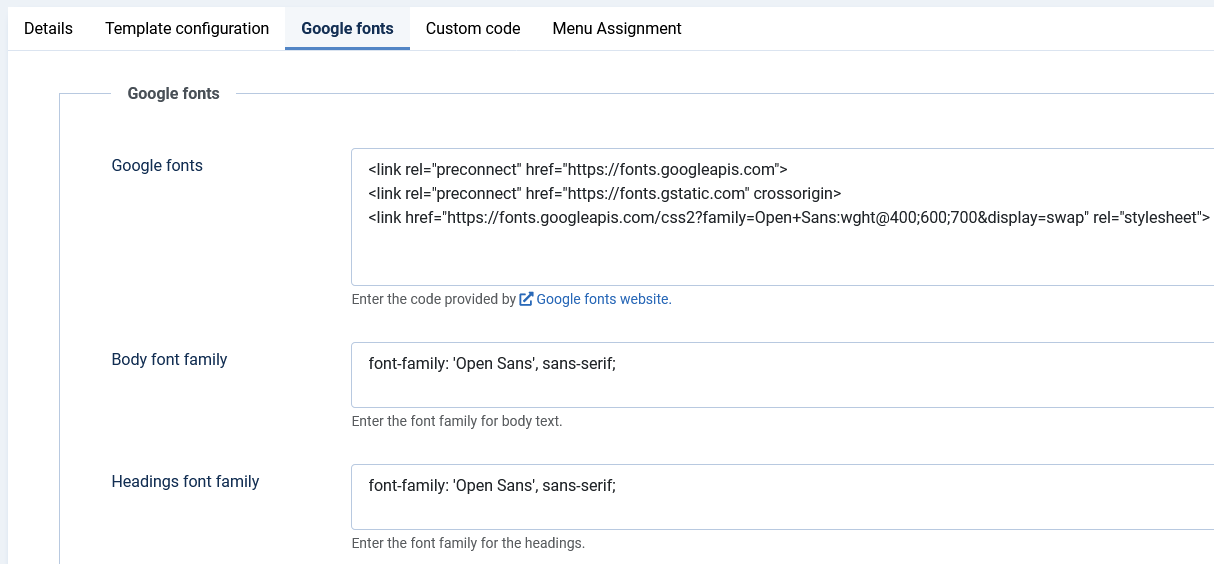
- Select the "Google Fonts" tab and enter the code you copied from the Google Fonts website in the "Google Fonts" field.
- Finally, enter the font family for the body text and headings in the Font Family fields.
Example using the Open Sans Google font
Module Positions
The available module positions are the following:
- topbarleft (style = none)
- topbar (style = none)
- languages (style = none)
- currencies (style = none)
- cart (style = none)
- login (style = none)
- menu (style = none)
- search (style = none)
- breadcrumbs (style = none)
- banner-1 (style = none)
- banner-2 (style = none)
- banner-3 (style = none)
- top-1 (style = html5)
- top-2 (style = html5)
- top-3 (style = html5)
- top-4 (style = html5)
- sidebar-left (style = html5)
- sidebar-right (style = html5)
- bottom-1 (style = html5)
- bottom-2 (style = html5)
- bottom-3 (style = html5)
- bottom-4 (style = html5)
- footer (style = html5)
- copyright (style = none)
- debug (style = none)
General module settings
Module width
If you need to publish more than one module on the same position and display them side by side (only for module positions with html5 style), you need to set the correct bootstrap size on the Advanced tab of the module settings.
By default, the bootstrap size is set to 0, which means that the module will have 100% width, the same is true for bootstrap size 12.
For example, if you want to display two modules at the top-1 module position, each with 50% width, you will need to set the bootstrap size to 6 for both modules. Note that these settings apply to screen sizes ≥992px, if you want the same width for smaller sizes, you must also add the appropriate bootstrap grid classes in the Module Class field. For example, you must add the col-md-6 class so that the modules display the same for screen sizes ≥768px.
The only module positions that will automatically display 50% width between 992px and 768px are the footer and sidebar.
To learn more about the available Bootstrap classes and the grid system please read the official Bootstrap 5 documentation.
Specific module settings and layouts
Below are instructions on how to configure modules to display as the demo content.
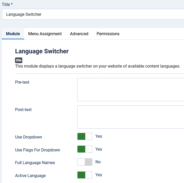
Language Switcher
- Module position = languages
- Use Dropdown = Yes
- Use Flags For Dropdown = Yes
- Full Language Names = No
- Active Language = Yes
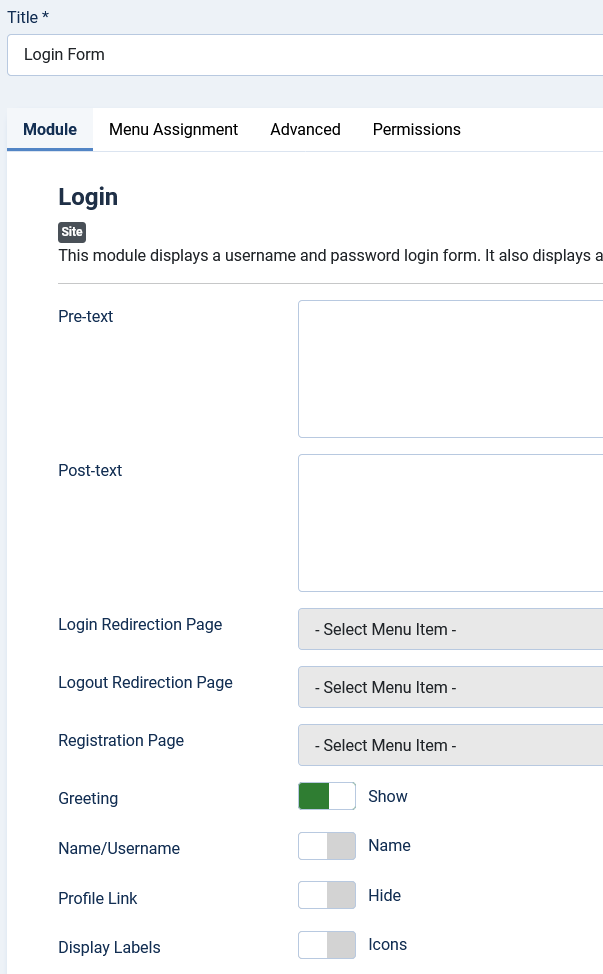
Login module
- Module position = Login
- Greeting = Show
VirtueMart Currency Selector
- Module position = currencies
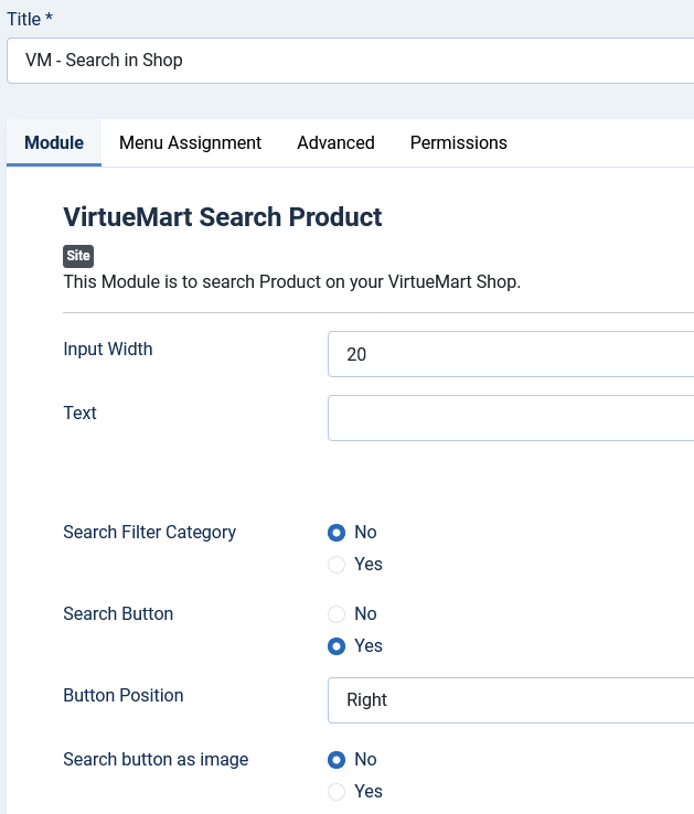
VirtueMart Search Product
- Module position = search
- Search Button = Yes
- Button Position = Right
- Search button as image = No
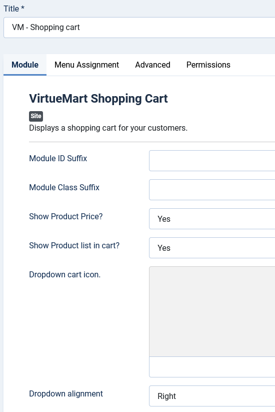
VirtueMart Shopping Cart
1 ) The dropdown layout is the preferred layout for the header area.
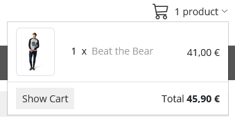
- Module position = cart
- Show Product Price? = Yes
- Show Product list in cart? = Yes
- Dropdown alignment = Right
- Layout = dropdown (You can find this option on the Advanced tab.)
2) The default layout is the preferred layout for the sidebar-left or sidebar-right position
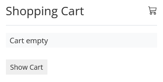
- Module position = sidebar-left or sidebar-right positions
- Show Product Price? = Yes
- Show Product list in cart? = Yes
- Layout = default (You can find this option on the Advanced tab.)
VirtueMart Products
The template has 2 different layouts for the Products module:
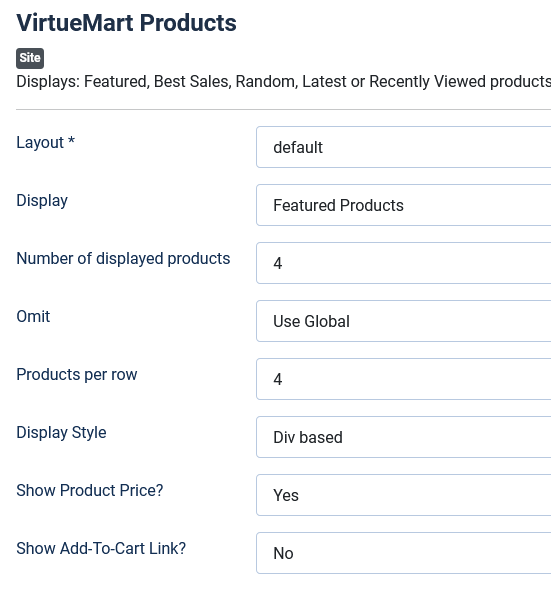
Layout default and display style div
This layout is better for full-width module positions (top-1, top-2, top-3, top-4, bottom-1, bottom-2, bottom-3, bottom-4).
In the demo, we use it on top-1 and bottom-1 module positions.
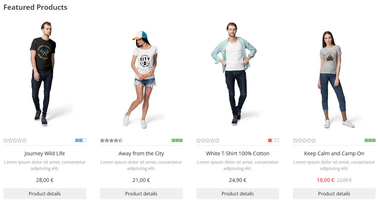
Settings
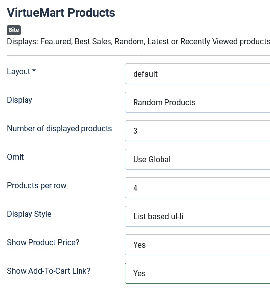
Layout default and display style list
This layout is better for use on sidebar-left and sidebar-right module positions, or for displaying two or more on full-width module positions.
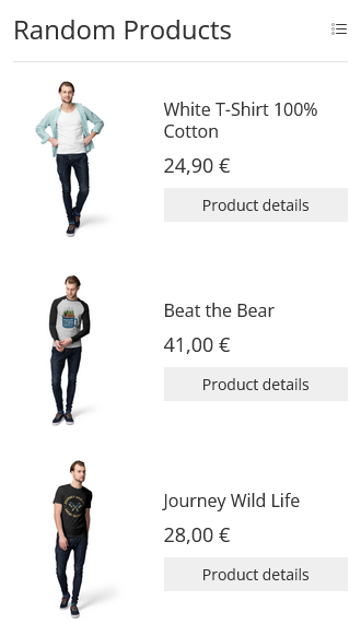
Settings
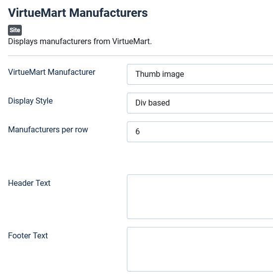
VirtueMart Manufacturers
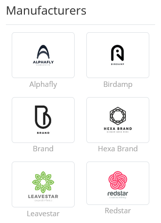
1) The Div Display Style with images

- Module position = bottom-2
- Display Style = Div based
- Manufacturers per row = 6
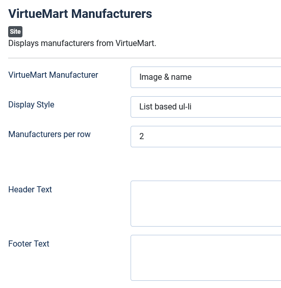
2) The List Display Style with images
- Module position = sidebar-right
- Display Style = List based ul-li
- Manufacturers per row = 2
VirtueMart Category
The Categories module has 4 layouts and is better used in the Sidebar-Left and Sidebar-Right module positions..
1) The default layout displays the parent categories and has an accordion effect to open the subcategories.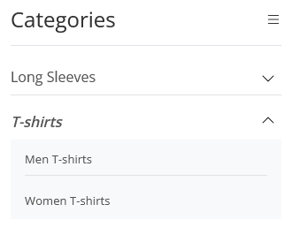
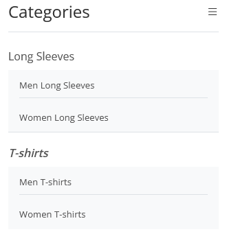
2) The All layout displays all sublevels directly.
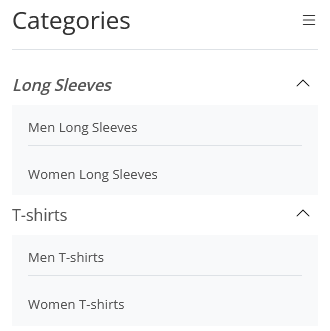
3) The current layout is similar to the default layout, but with a change in accordion behavior. When you click to open a sublevel, previously opened sublevels stay open instead of collapsing automatically.
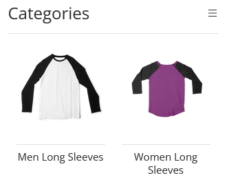
4) The wall layout is a grid and can also display the category images. This layout does not allow you to display sublevels.
Custom css
If you need to make CSS changes, the template provides two main options:
- For small CSS changes, you can use the Inline Custom CSS field on the Custom Code tab of the template configuration page.
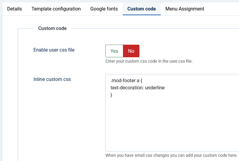
- For extensive css changes, you can use the user.css file in the
/media/templates/site/vmbasic/css/folder:
a) Add your css code to the user.css file
b) Activate the option "Enable user css file".
Layout Overrides (Component, module and plugin overrides)
For information on creating a layout override, please refer to the official Joomla! documentation Layout Overrides in Joomla.
Creating a child template
If you need to override a core template file (index.php, component.php, error.php, offline.php, vmbasic.css, etc.), the best way to do so is to create a child template. Child templates are not affected by updates, so your changes will be preserved when you install a newer version of the template.
Please refer to the official Joomla! documentation for information on how to create a child template.
Adding custom or tracking javascript
If you need to add a script to the template, such as analytics, heatmaps, etc., the template provides two fields for this on the Custom Code tab of the template configuration page:
- Add js script in head field is for any js script that must be added before the head closing tag.
- Add js script in body field is for any js script that must be at the end of the body.
